
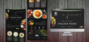
Why Website Design Matters for Restaurants?
Your restaurant’s website is often the first interaction potential customers have with your brand. In today’s digital-first world, diners don’t just stumble upon a restaurant, they research it first. A poorly designed site can drive them straight to a competitor, while a clean, functional, and optimized website can lead directly to reservations and orders.
For restaurants, website design is not just about aesthetics, it’s about conversions. Every second of loading time, every misplaced button, and every missing feature can cost you a customer.
The Role of User Experience (UX) in Restaurant Conversions
User experience (UX) determines how easy and enjoyable your website is to use. A restaurant website that prioritizes UX guides visitors smoothly from discovery to booking a table, ordering food online, or making a call.
Think about it this way: If a hungry customer can’t find your menu in a few clicks, or if your reservation system feels clunky, they won’t stick around. Great UX removes friction, creates trust, and makes it simple for customers to take action.
Mistake #1: Slow Loading Speed and Poor Performance
Nothing frustrates users more than a website that takes forever to load. Google research shows that if a page takes longer than 3 seconds to load, more than half of users will leave. For restaurants, that’s a lost customer who may have otherwise booked a table.
- Large, uncompressed food images
- Bloated plugins or scripts
- Weak hosting servers
All of these can drag your site speed down. Performance optimization, compressing images, using a content delivery network (CDN), and leveraging caching, is non-negotiable if you want conversions.
Mistake #2: Not Mobile-Friendly or Responsive Design
More than 60% of restaurant searches happen on mobile devices. If your website doesn’t adapt seamlessly to different screen sizes, you risk alienating the majority of your audience.
A responsive design ensures your content, images, and booking features are easy to use on smartphones and tablets. A poor mobile experience, tiny fonts, buttons too small to click, or menus that don’t load, creates frustration and leads to abandoned visits.
Mistake #3: Confusing Navigation and Menu Structure
Your website navigation is the roadmap for visitors. If it’s cluttered or poorly labeled, users won’t know where to go. For restaurants, the essentials should always be:
- Menu (clearly visible and easy to open)
- Reservations/Order Online
- Location and Contact Information
- About/Story
Avoid burying your menu under multiple dropdowns or making users scroll endlessly to find your hours. Simplicity in navigation reduces bounce rates and keeps potential diners engaged.
Mistake #4: Weak or Missing Calls-to-Action (CTAs)
A restaurant website must guide visitors toward an action, whether that’s “Reserve a Table,” “Order Now,” or “Call Us.” Without strong CTAs, users may browse but never convert.
Common CTA mistakes include:
- Using vague language like “Click Here” instead of “Book Your Table Now”
- Placing CTAs only at the bottom of the page
- Making buttons too small or poorly contrasted
Strategic placement of bold, clear CTAs across your homepage, menu pages, and blog posts ensures customers always know their next step.
Mistake #5: Overlooking Online Reservation & Ordering Features
Today’s diners expect convenience. If they can’t book a table or place an order directly through your site, they may head to a third-party app, or worse, to a competitor.
Restaurants often miss conversions by:
- Not integrating booking systems like OpenTable
- Linking to outdated PDFs instead of interactive ordering
- Lacking delivery or pickup options
Your website should work as your best employee, always ready to take a booking or order at any hour.
Mistake #6: Cluttered Layouts and Poor Visual Hierarchy
Too much text, too many images, or competing design elements overwhelm visitors. Instead of guiding users toward an action, clutter creates confusion.
What to avoid:
- Multiple fonts and inconsistent colors
- Busy backgrounds that distract from food images
- Lack of spacing between elements
A clean layout with a strong visual hierarchy (headings, subheadings, buttons) ensures customers focus on what matters, your food, your story, and the next action.
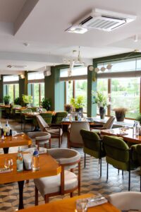
Mistake #7: Using Low-Quality Food Photography
Food is a visual experience, and low-quality photos can kill appetite instantly. Grainy, poorly lit images of your dishes don’t just look unappealing, they damage your brand.
Investing in professional food photography makes a world of difference. Showcase high-resolution images with good lighting and authentic styling. For many restaurants, food photos are the single most influential factor in a customer’s decision to book or order.
Mistake #8: Lack of Clear Contact and Location Information
Imagine wanting to call a restaurant and spending 5 minutes trying to find the phone number. That’s a quick way to lose a customer.
Always display:
- Phone number (click-to-call on mobile)
- Address linked to Google Maps
- Opening hours
- Social media icons
Some restaurants hide contact info on a “Contact Us” page buried in the footer. Instead, make these details visible in the header, footer, and dedicated page.
Mistake #9: Ignoring Local SEO and Schema Markup
If your restaurant website doesn’t show up in local searches, you’re invisible to diners nearby. Local SEO optimization ensures you appear for searches like “best Italian restaurant near me.”
Key tactics include:
- Adding local keywords in titles, descriptions, and content
- Embedding a Google Map on your site
- Implementing schema markup for menus, reviews, and reservations
Schema helps search engines display your restaurant’s details, hours, price range, menu, in rich snippets, increasing click-through rates.
Mistake #10: No Integration with Social Proof (Reviews & Testimonials)
Social proof influences dining decisions more than ads. If your website doesn’t showcase reviews and testimonials, you’re missing out on trust-building.
Ways to integrate social proof:
- Display Google or Yelp reviews directly on your homepage
- Add video testimonials from satisfied customers
- Show social media feeds with user-generated content
Trust signals reassure visitors that others enjoyed your restaurant, and encourage them to book.
Mistake #11: Hard-to-Find or Outdated Menu Pages
Menus are the most visited pages on restaurant websites. If yours is outdated, hidden as a PDF, or doesn’t load on mobile, you’re killing conversions.
Best practices:
- Publish menus as HTML pages (search engines can index them)
- Update regularly to reflect seasonal changes
- Use enticing descriptions with keywords and appetizing visuals
A fresh, easy-to-access menu keeps visitors engaged and hungry for more.
Mistake #12: Poor Accessibility for All Users
Accessibility ensures your website can be used by everyone, including people with disabilities. Restaurants often overlook this, but it directly impacts conversions and even compliance with ADA (Americans with Disabilities Act) in the U.S.
Accessibility essentials include:
- Alt text for images
- High color contrast between text and background
- Keyboard-friendly navigation
- Screen-reader compatibility
A site that’s inclusive not only avoids legal risks but also expands your audience.
Best Practices to Fix These Restaurant Website Mistakes
Fixing these issues doesn’t mean you need to rebuild your restaurant’s website from scratch. Instead, it’s about refining what you already have so every visitor can smoothly move from browsing to booking or ordering. Here’s how:
Prioritize Speed
Speed is one of the biggest factors in keeping users engaged. If your site takes too long to load, hungry customers won’t wait around. Compress large food images, host your site on a reliable server, and use caching tools or a CDN (Content Delivery Network) to ensure pages load quickly no matter where your customers are.
Be Mobile-First
Since most diners search for restaurants on their phones, your website should feel like it was built for mobile first, not just adapted for it. Buttons should be large enough to tap easily, text must be legible without zooming, and forms should be quick to complete. Test your site on multiple devices to make sure the experience is seamless.
Simplify Navigation
Visitors should never feel lost when exploring your site. A clean, simple navigation bar works best.
- Include only the essentials: Menu, Reservations/Order Online, Location, and Contact.
- Avoid overloading dropdown menus with unnecessary pages.
- Consider adding a sticky header so users can always access key sections.
Highlight CTAs
Calls-to-action (CTAs) are the signposts that guide users toward booking or ordering. Weak or vague CTAs lose customers.
- Use bold, action-driven text like “Book a Table Now” or “Order Online.”
- Place buttons prominently above the fold and throughout your pages.
- Choose colors that contrast with your background so they stand out immediately.
Enable Easy Ordering/Booking
Online reservations and ordering should feel effortless. If customers can’t book or order in seconds, they’ll leave. Integrate booking platforms like OpenTable or Resy directly into your site, and if you offer takeout or delivery, make sure ordering is built-in and user-friendly. Multiple payment options also add convenience and increase conversion rates.
Invest in Photography
Your dishes are the star of the show, and your photos should reflect that. Low-quality, poorly lit images will turn people away. Professional photography highlights your food in the best light, while also showcasing your restaurant’s interior, ambiance, and staff. Think of photography as an investment in appetite appeal.
Update Menus Often
Menus are often the most visited pages on a restaurant website, and nothing frustrates users more than outdated or missing items.
- Keep menus updated with current pricing and seasonal specials.
- Avoid uploading static PDF menus, use HTML pages that search engines can crawl.
- Pair dishes with tempting descriptions and professional food photography.
Leverage SEO & Schema
SEO ensures your restaurant is visible in local searches, while schema markup helps search engines better understand your content.
- Use local keywords like “best sushi restaurant in London” in your meta titles and descriptions.
- Implement schema for menus, reviews, and opening hours so Google can display rich snippets.
- Embed Google Maps on your contact page for extra local SEO signals.
Show Social Proof
Reviews and testimonials build instant trust with visitors. A website without them can feel incomplete.
- Showcase top Google, Yelp, or TripAdvisor reviews directly on your homepage.
- Include customer photos and user-generated content from social media.
- Add testimonial videos where possible for maximum credibility.
Commit to Accessibility
An accessible website ensures every potential customer can interact with your brand, including those with disabilities. Accessibility also improves your SEO. Use alt text for all images, maintain strong color contrast for text, and design pages that are keyboard-friendly. These small steps make a big difference in inclusivity and usability.
Conclusion
A high-performing restaurant website doesn’t need to be flashy, it needs to be functional. By improving speed, optimizing for mobile, simplifying navigation, and adding strong CTAs, you guide diners toward conversion. Regularly updated menus, professional photos, social proof, and accessibility ensure your site serves every visitor effectively.
At CJ Digital, we help restaurants and hospitality brands avoid these costly website mistakes and transform their online presence into a steady stream of bookings and orders. With the right design and strategy, your website can become your restaurant’s most powerful marketing tool.